How to Choose Fonts for Wedding Invitations in the UK
Learn how to choose wedding invitation fonts in the UK with tips on font styles, readability, pairing, and printing for your special day.
Wedding invitations give guests their first impression of your special day. The font you choose can make the invitation look elegant, traditional, modern, or casual. It also affects how easily guests can read important details, such as the wedding date, venue, and names of the couple.
When choosing fonts for wedding invitations in the UK, consider your wedding theme, the level of formality, and the type of paper you plan to use. You should also think about how different fonts look together and whether they remain clear when printed.
Match the Font to Your Wedding Theme
Choose a font that matches your wedding style to keep your invitations and decorations consistent. Serif and calligraphy fonts suit traditional weddings, while handwritten and sans-serif fonts work well for rustic and modern celebrations.
Here are some examples:
- Traditional wedding: Classic serif fonts with refined letter shapes.
- Rustic wedding: Handwritten fonts with a natural appearance.
- Modern wedding: Clean sans-serif fonts with simple lettering.
- Romantic wedding: Flowing script fonts with decorative curves.
- Minimalist wedding: Simple fonts with balanced spacing and little decoration.
Consider the Formality of the Wedding
Your wedding's formality can help you choose a suitable font. Script and serif fonts work well for formal ceremonies, while handwritten and sans-serif fonts suit more casual celebrations.
For example, you can display the couple's names in different styles:
Script style: 𝓙𝓪𝓶𝓮𝓼 & 𝓢𝓸𝓹𝓱𝓲𝓮
Classic style: 𝐉𝐚𝐦𝐞𝐬 & 𝐒𝐨𝐩𝐡𝐢𝐞
These Unicode examples show different lettering styles. You can look for actual fonts with a similar appearance when designing your invitations. Traditional wording and a centred layout can also suit formal weddings, while casual celebrations allow more flexibility.
Prioritise Readability
Your wedding invitation should be easy to read, especially when it includes important details such as names, dates, venue addresses, and RSVP instructions. Decorative fonts can have unusual shapes and flourishes that become difficult to read at smaller sizes.
Keep these points in mind:
- Choose a clear font for the wedding date, time, and venue.
- Avoid very thin lettering that may not print clearly.
- Use a suitable font size for important details.
- Make sure the text contrasts with the background.
- Check that decorative letters do not make names difficult to recognise.
For example, use a script font for the couple's names and a simple serif font for the remaining text. This keeps the invitation elegant and readable.
Choose Fonts That Work Together
Pairing two complementary fonts can help you create a balanced invitation. Use one font for the couple's names and another for the main text. A decorative script font paired with a simple serif or sans-serif font is one option.
Here are a few font pairing ideas:
- Script + serif: Suitable for traditional and romantic weddings.
- Script + sans-serif: Works well for modern invitations with an elegant touch.
- Serif + sans-serif: Creates a balanced look for formal and contemporary weddings.
- Handwritten + simple serif: Suits rustic weddings and outdoor celebrations.
Avoid using too many font styles in one design. Two fonts are often enough. You can also use different sizes, weights, or letter spacing to make names and headings stand out without adding another font.
Consider the Invitation Size and Printing Method
Choose a font that remains clear at your invitation's printed size. Small invitations may not show fine lettering and decorative details clearly, while larger designs offer more room for elaborate styles.
Paper texture and printing methods can also affect the result. Fine lettering may be harder to reproduce on textured paper, so check your font before using foil printing or letterpress.
Before printing the full set, follow these steps:
- Print a sample at the actual invitation size.
- Check that all text is easy to read.
- Look for thin strokes or decorative details that have become unclear.
- Check how the font looks against the paper colour and texture.
- Make any necessary adjustments before printing the full set.
If you are sending digital invitations, check how the fonts appear on mobile phones as well. Guests should be able to read the details without excessive zooming.
Popular Font Styles for Wedding Invitations
There are several font styles you can use for wedding invitations. Each has a different appearance, so the right choice depends on your theme and personal preferences.
Script and Calligraphy Fonts
Script and calligraphy fontshave flowing letters and decorative strokes. They are popular for wedding invitations because they can give names and headings an elegant appearance.
For example:
𝓦𝓮𝓭𝓭𝓲𝓷𝓰 𝓘𝓷𝓿𝓲𝓽𝓪𝓽𝓲𝓸𝓷
These fonts work well for the couple's names, short headings, and selected phrases. However, some styles can be difficult to read in smaller sizes, so use a simpler font for the main details.
Serif Fonts
Serif fonts have small finishing strokes at the ends of many letters. They often have a classic appearance, making them suitable for traditional, vintage, and formal wedding invitations.
For example:
𝐖𝐞𝐝𝐝𝐢𝐧𝐠 𝐈𝐧𝐯𝐢𝐭𝐚𝐭𝐢𝐨𝐧
This bold Unicode example illustrates a traditional, structured appearance, although actual serif fonts can look different. You can use a serif font for the main invitation text, headings, or the couple's names.
Sans-Serif Fonts
Sans-serif fonts do not have the small finishing strokes found in serif fonts. Their clean letter shapes make them suitable for modern and minimalist wedding invitations.
For example:
𝗪𝗲𝗱𝗱𝗶𝗻𝗴 𝗜𝗻𝘃𝗶𝘁𝗮𝘁𝗶𝗼𝗻
Sans-serif fonts work well for practical details, such as the venue address, date, and RSVP information. They can also be used throughout the invitation for a simple and consistent look.
Handwritten Fonts
Handwritten fonts imitate natural handwriting. Depending on the style, they can look casual, personal, or slightly decorative.
For example:
𝒥𝒶𝓂𝑒𝓈 & 𝒮𝑜𝓅𝒽𝒾𝑒
This Unicode example has a handwritten appearance. Similar fonts can work well for rustic weddings, garden ceremonies, and relaxed celebrations. Choose a style with clear letters so guests can easily read the names and other details.
Important Note: Keep in mind that Unicode examples are useful for comparing general lettering styles, but they do not always represent actual installable fonts. Some characters may also display differently across devices or printing software.
Create Wedding Fonts Instantly with Wedding Fonts Generator
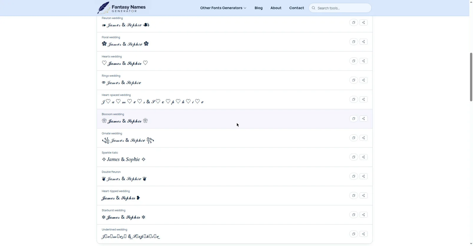
You can create stylish text for your wedding invitations using Wedding Fonts Generator. It converts regular text into different font styles that are suitable for wedding invitations. Here’s how to use it:
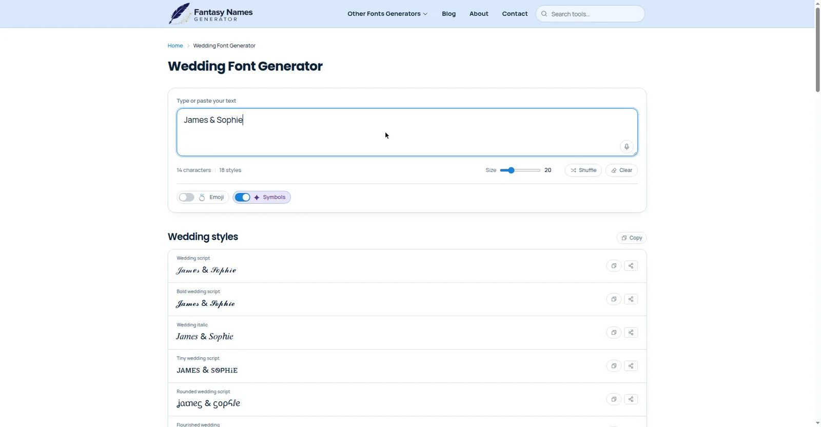
- Open the Wedding Fonts Generatorwebsite.
- Enter your text in the input box.
- Browse the available font styles.
- Choose your preferred style and copy the text.
- Paste it into your wedding invitation design.
Tips for Choosing Wedding Invitation Fonts in the UK
Along with your wedding theme and preferred style, a few practical details can help you make a suitable choice.
- Consider the venue: A historic building, countryside estate, or modern hotel may suit different invitation styles. Choose a font that fits the setting.
- Check the date format: Make sure the wedding date is clear and consistent with the format you prefer. For example, you could write 27 October 2026 to avoid confusion.
- Check names and locations: Test any special characters, punctuation, and place names that appear in your invitation.
- Think about your guests: Use readable lettering and a suitable text size, particularly for essential information.
- Check font licensing: If you are designing invitations for commercial printing, make sure the font licence permits your intended use.
- Keep the design consistent: Use similar fonts and spacing across your invitations, RSVP cards, and other wedding stationery.
- Order a sample: Review a printed copy before placing a large order, especially if you are using decorative lettering or a special printing method.
You do not need to follow a strict set of rules when choosing a font. These tips can help you create an invitation that suits your wedding while keeping the information clear for your guests.
Final Words
Choosing fonts for wedding invitations in the UK involves balancing appearance and readability. Start with a style that matches your wedding theme, then consider the formality of the ceremony, font pairing, invitation size, and printing method.
Script, serif, sans-serif, and handwritten fonts can all work well when used in the right way. Before printing your invitations, test the design on paper and make sure guests can easily read every important detail.