

How to Use Small Caps Without Making Text Hard to Read
Learn how to use small caps for stylish text while keeping it readable with simple tips on spacing, font size, contrast, and placement.

Small caps can give your text a subtle touch of fantasy, making names, headings, and short phrases look like they belong in an enchanted book or a magical kingdom. Their smaller uppercase letters create a distinct style without making words too large or bold.
However, using this style everywhere can make text harder to read. The trick is to balance its decorative appeal with clear lettering, proper spacing, and a comfortable size so your text stays easy to follow.
Use Small Caps for Short Text
Small caps work best for short words and phrases that need a different appearance. You can use them for fantasy-styled names, creative headings, decorative labels, or a few important words in a design.
For example, a short heading in small caps can look neat and stand out from the rest of the text. This style is also useful for usernames and short profile descriptions.
Avoid Using Them in Long Paragraphs
Using small caps for an entire paragraph can make reading tiring. When every word follows the same visual style, readers may find it harder to scan the text quickly.
Keep regular text for long explanations, articles, and instructions. You can use small caps for a heading or a few important words while leaving the rest of the content in its normal style.
Choose a Readable Small Caps Style
Not every small caps style is equally easy to read. Some use simple letter shapes, while others include decorative details that can make words harder to recognize.
Choose a style with clear, recognizable letters, especially when the text needs to communicate information. Avoid overly decorative options for important headings, labels, or other text that readers need to understand quickly.
Use Proper Spacing Between Letters
Letter spacing affects how easily readers can recognize words. When letters sit too close together, small caps can look crowded. Excessive spacing can also make words difficult to read as a whole.
If you are designing text in a graphic editor, adjust the spacing until the letters look clear and balanced. For short phrases, a little extra space may improve the appearance without making the text feel disconnected.
Create Contrast With Regular Text
Combining small caps with regular text helps create a clear visual difference between headings and body content. It also lets you highlight certain words without changing the style of every sentence.
For example, you can use small caps for a section heading and regular text for the explanation below it. In a graphic design, you can apply small caps to a short label while keeping the main message in a standard font.
Consider Font Size and Background
Small caps should be large enough to read comfortably. If the letters are too small, readers may struggle to recognize them, particularly on mobile screens.
The background also affects readability. Use enough contrast between the text and its background so that the letters remain clear. For example, dark text on a light background or light text on a dark background usually works well.
Use Small Caps for the Right Purpose
Small caps are useful when you want to give text a distinct appearance without making it look too large. However, they are not suitable for every type of content.
Consider the purpose of your text before choosing this style. Use small caps for short headings, names, and decorative elements. For detailed instructions, long articles, and other content that requires careful reading, regular text is usually a better choice.
How to Generate Small Caps Text Online
You can use Small Caps Generator to convert regular text into a small caps style. This is a simple way to create text without manually changing each letter.
Here is how to use it:
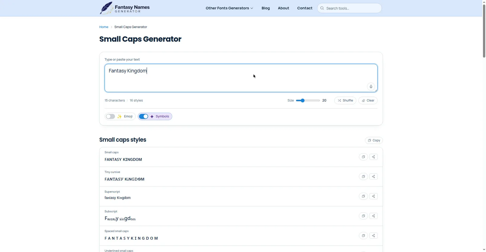
- Open the Small Caps Generator.
- Enter the text you want to convert.
- Choose a small caps style from the available options.
- Copy the converted text.
- Paste it into your social media profile, message, or design.
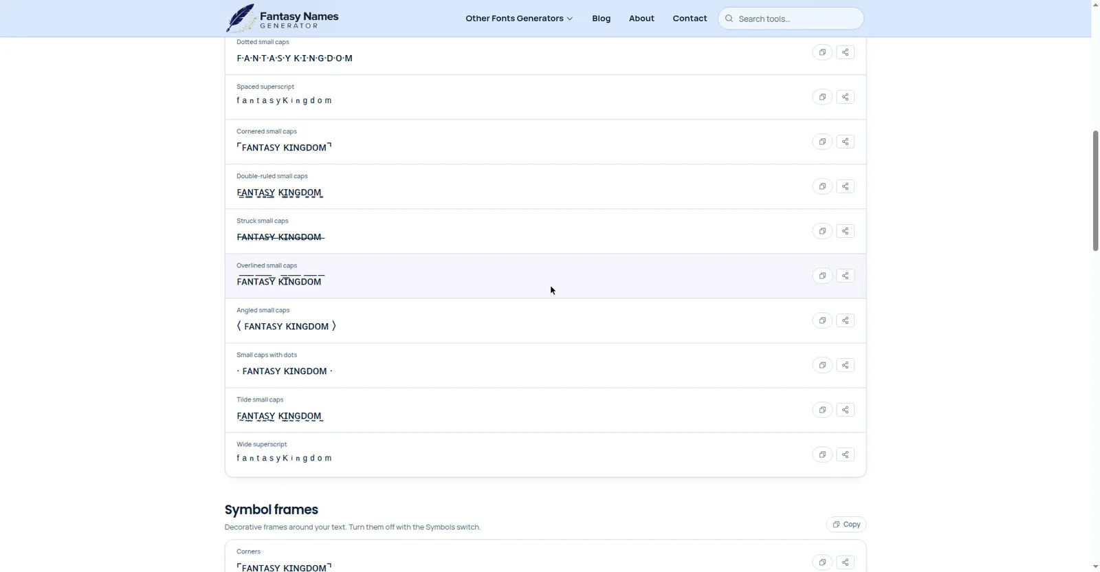
Before using the text, check how it looks on your intended platform. Some small caps styles use special Unicode characters, so their appearance may vary between devices and applications.
Where Can You Use Small Caps?
Small caps can work in different types of content, depending on the design and purpose.
- Social media profiles: Use small caps for usernames, short bios, or profile descriptions.
- Headings and titles: Give section headings a neat and distinct appearance.
- Graphic designs: Add small caps to posters, banners, and promotional images.
- Branding: Use them for short brand names, labels, or other design elements.
- Gaming profiles: Style usernames, short status messages, and profile descriptions.
In each case, keep the text short and easy to recognize. This helps the style stand out without making the content difficult to read.
Final Words
Small caps can give your text a clean and distinctive appearance when used correctly. Keep them for short phrases, choose readable letter styles, and pay attention to spacing, size, and contrast.
Avoid using them throughout long paragraphs, where regular text is easier to follow. By choosing the right places for small caps, you can make your text look stylish while keeping it clear and comfortable to read.